NewCo
This project has been white-labeled since it has not been launched…yet. Provide a holistic vision across the lines of business for a personalized and seamless customer experience, enabling NewCo to be the leading partner in reimagining local healthcare and well-being for all. Setting a trajectory for the future while delivering value in the near term.
-
I am the Senior Product Designer working on journey maps, wireframes, and visual design. I have also been leading the team in accessibility making sure all users will be able to enjoy the new NewCo app.
-
Figma
Application Mapping
The first step in discovery was mapping out the entire NewCo app. We broke up into pods and divided and conquered from there. I took charge of Retail and Find Care.
Journey Mapping
I built out current state journey maps for retail to define pain points and opportunity areas for feature identification and testing.I collaborated with my pod and the entire team to make it as robust as possible. We broke them up into three journeys:
Product Delivery and Pickup
Buy Again
Purchase with a coupon
Define
Once we collaborated with our stakeholders, we then went on to define the experience briefs, opportunities, and jobs to be done.
Wireframes
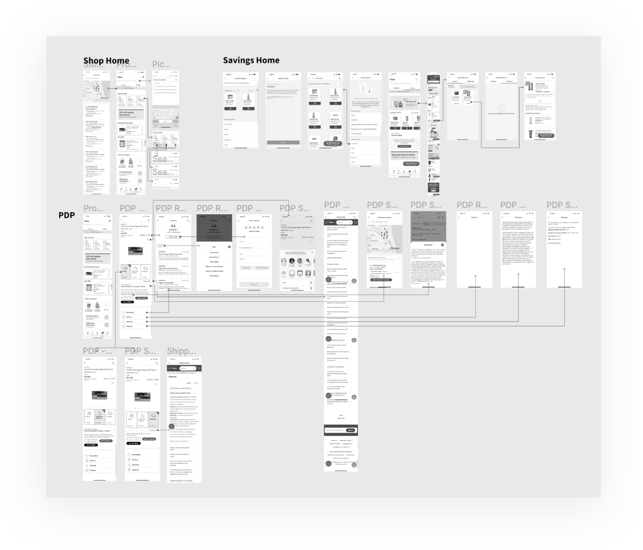
Now that the opportunities and experience briefs have been developed, we have moved onto wireframing. Here I am using the key points from the experience brief to influence my designs. I am also leading the team in accessibility research and direction.
User Testing
Qualitative research was done with 26 participants across Discovery and Delivery work streams. These interviews led to insight reports across both work streams, and became a desirability input into our feature list. This test was a study in desirability of various features and not a usability study.
The prototype went from the home screen to various LOBs. Depending on the user’s preference we led with Health & Rx,, or Photo. Wallet was tested within the navigation and with expanded functionality.
Design Iteration
Using both user and stakeholder feedback, we were able to iterate and refine on the high fidelity wireframes. We created new features and design components, based off the established NewCo design system.
I was leading the Retail section and helping with the Wallet and Photo sections.
Personalization
Most customers expected everything to have an element of personalization, elevating key information for them. Some found the amount of content overwhelming and viewed personalization as a way to filter information.
Personalized content elevated, giving customers quick access to the things they buy most.
“ I would want to see coupons first, because everyone uses them, and it is good to have them front and center”
Wallet
Wallet wasn’t just useful functionality, for many it was a reason to download the app. Customers, even the less tech-savvy ones, would use the scan functionality in-store and felt like this maximized savings.
Seeing clipped coupons shown here was very valuable, but many also appreciated the gateway to other offers through the savings tab of the in-store mode, and personalized savings throughout the experience.
"I specifically download apps for cards payments. I definitely could see myself using this for NewCo.”
Shop Home User Feedback
Positive: Deals and products combined on a single page was a big success, customers loved being able to see what was on sale.
Positive: Saved for later products were very well received, especially for those who were buying items for others, like parents.
Negative: Some customers got confused at different CTA’s they wanted consistency with how their coupons were organized and applied.
Product Listing Page User Feedback
Positive: Banners and tags on on-sale items were welcomed and customers often gravitated towards those with the blue tags.
Search was clear and straightforward, customers liked being able to quickly see what was in stock and see relevant deals.
Positive: Customers appreciated shopping and savings being combined into one centralized location. It made deals easier to find and deals were a big engagement driver leading to repeat app visits.
Neutral: Many mentioned they would likely never even go to the PDP and would just check whether something was in stock via search.
Product Detail Page User Feedback
Positive: The comparison tool tested very well once shown. Many noted that they often compare products, especially OTC medications, and this was an easy interaction.


