Modernize the site from the digital rendering of a weekly flyer to a fully developed e-commerce experience.
Home Hardware Redesign
-
I was the Senior Visual Designer responsible for designing all of the components while maintaining the brand while creating a new digital brand style. Other deliverables included a digital style guide, accessibility color audit, and interactive prototypes.
-
Sketch and InVision
-
Exploration and collaboration are integral parts of my design process. For this project, I worked closely with the UX director, Lead Visual designer, and stakeholders. We held daily work and collaboration sessions with our internal team to address feedback, and we regularly hosted live working sessions with the clients to foster a collaborative working relationship.
Style Tiles
The style tile process allowed us to gather stakeholder input before really diving into the visual design and facilitated a collaborative relationship from the start.
I created two style tiles, Sugar Cookie and Ginger Snap. Sugar cookie was the light and airy option: light grey backgrounds, lifestyle-focused imagery, use of the brand red reserved for buttons and links, thin-weight icons, and use of the lighter font weights. Ginger snap was bold and playful: the brand red was used extensively as a background and the brand yellow was added as an accent color, imagery focused on DIY and products, and icons are bold, and repeat the use of red.
Color Audit
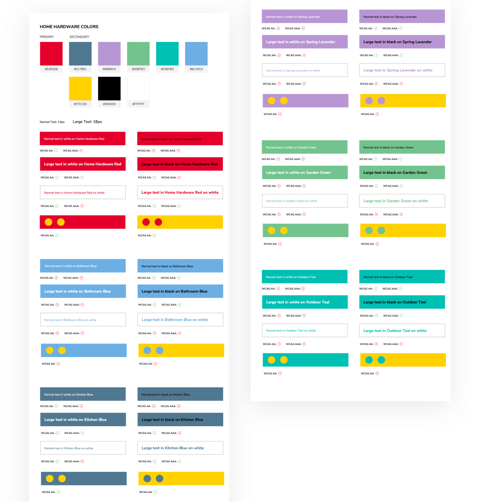
As part of the style tile process, I also introduced the stakeholders to accessibility with color contrast. I believe color contrast is an easy introduction to accessibility measures because it is visual and allows stakeholders to use readily-available tools to test and see the results. To help with this process, I created a color audit sheet that was scannable and easy to understand.
Header Accessibility
When designing the Home Hardware header, we first considered hierarchy. We designed the UI to accommodate screen readers, which prioritize content from left to right and top to bottom. While the logo would ideally appear first, the design required universal navigation based on client requirements. Informed by user research and card sorting, the navigation was reorganized and expanded so users could choose to navigate by Products or Rooms, depending on their mental model.
Creating visual queues, such as active and hover states, allows users to orient themselves to their current location while exploring different sections. This is key to creating a usable design.
The red underline lets the user know that they are currently reviewing the Productions mega menu.
Providing the light gray background then grounds the tertiary items to the Tools & Accessories fly-out.
Variety & Consistency
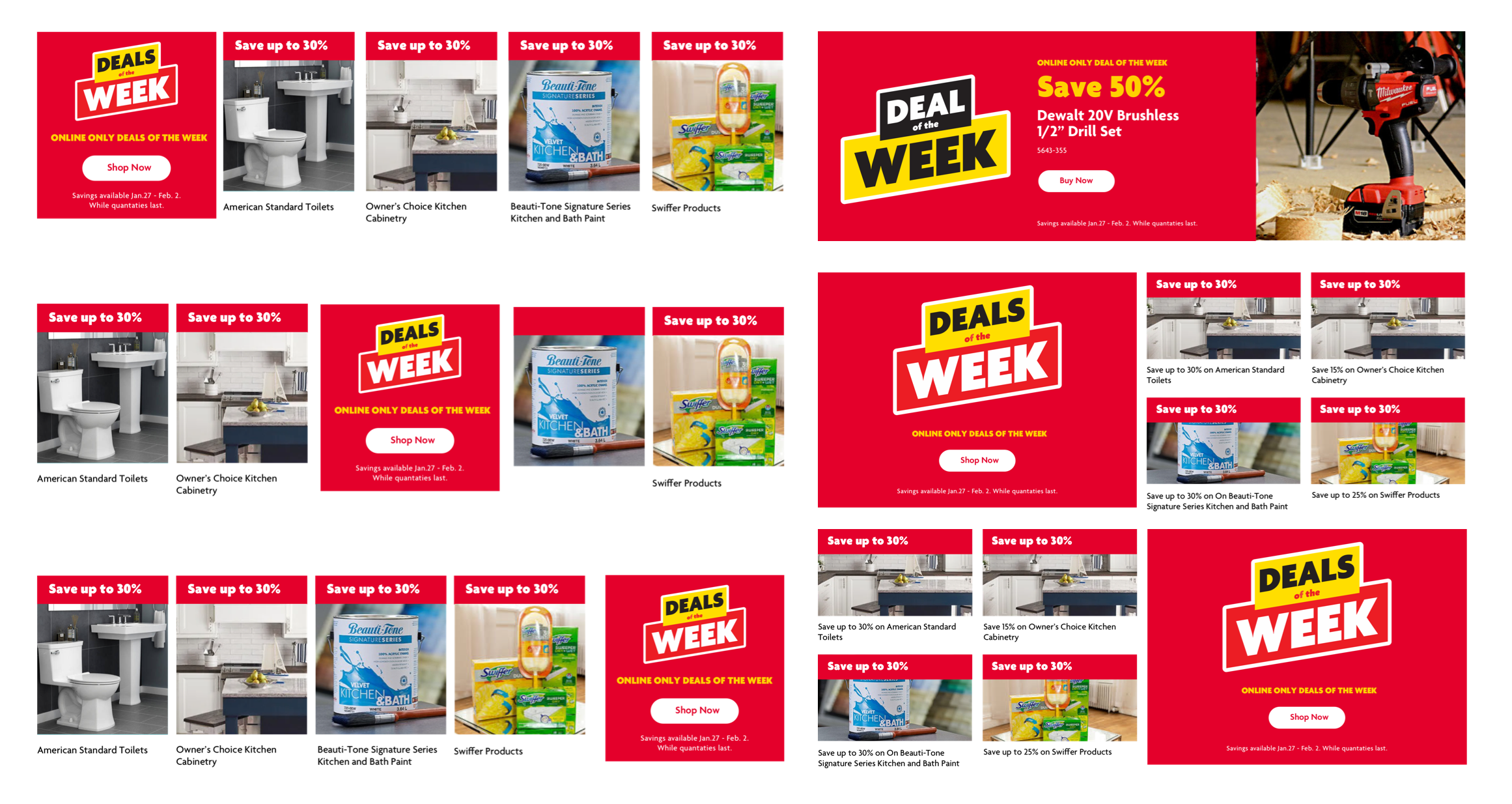
When designing the components, it was important to design for consistency, accessibility, and creative variety. The Home Hardware team needed flexibility, so we developed multiple versions of the card components. Having options ensure the cards are accessible and consistent across the experience, unlike on the previous site.
Accessible Carousels
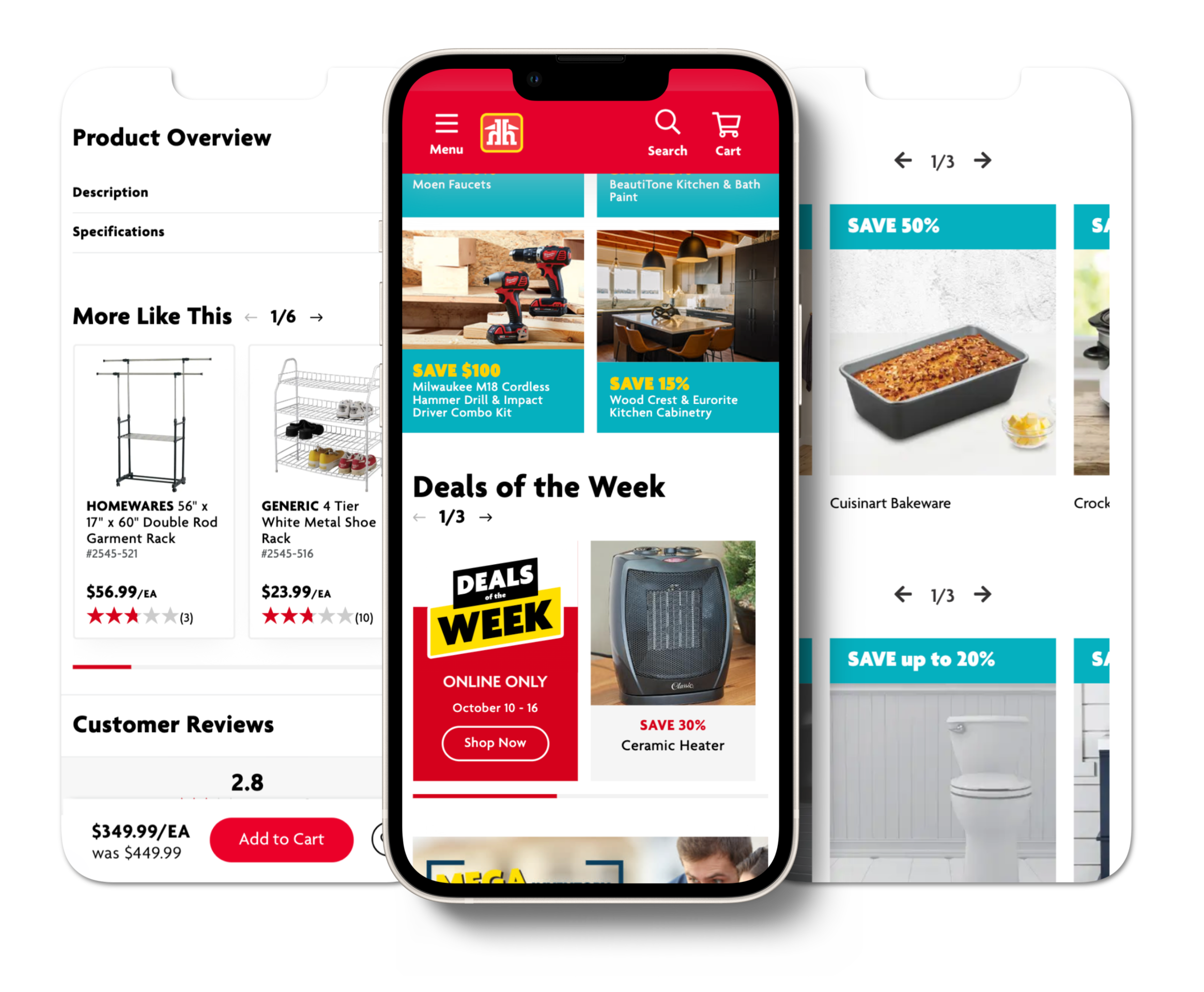
We also created accessible mobile carousels! Adding pagination above the content allowed screen readers to know how many slides are in the carousel so they skip if needed, which also keeps them from getting stuck.
Store Location
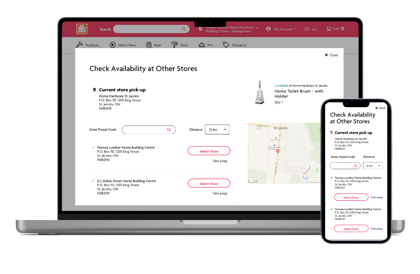
Now that Home Hardware ships to home, we wanted to make sure the users could check other stores for out-of-stock items, and be able to change the store they are buying from (every store is individually owned, so selecting a store to ship from is important for HH stock and sales).
Filtering
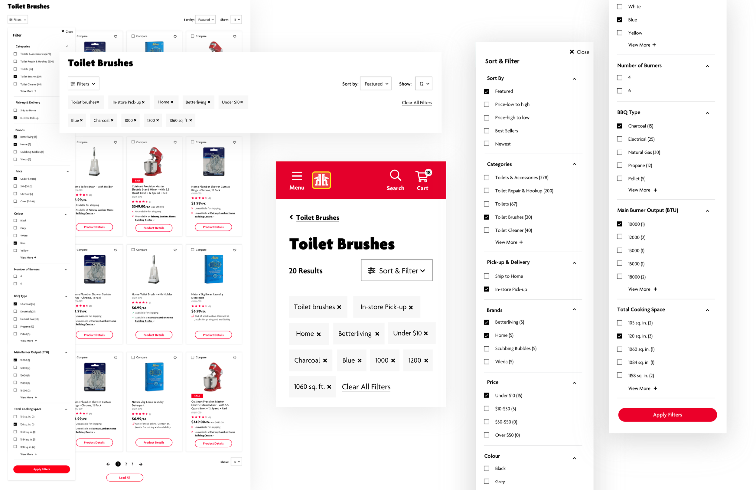
Updating the PLP filtering to a robust and user-friendly one was important. The current filtering was limited, dated, and not super user-friendly. I included all elements of filtering outside of “sort by” and “show” in the filtering menu – this kept the page focused on the products. Keeping the filtering in a collapsed menu creates less noise on the page. Once filters are selected, they appear and the user has the ability to clear single ones or clear them all.
Product Cards
I gave the product cards a refresh, the previous ones were dated. Making the product image smaller, and removing the carousel allowed the product to shine. I added the ability to add the product to the user’s favorites on the card, instead of just on the detail page. I presented 2 options to the stakeholders, a simple one for MVP 1 and a more robust one for the future.
Product Details
I created a modernized product detail page that prioritizes organization and hierarchy. I brought in the accessible image carousel, condensed the product overview into accordions, and put the fulfillment together. The accordions will be closed when the user lands on this page, that is because 90% of sales come from the “More Like This” carousel, so it was important that is be high on the page.
I also removed the auto zoom on the product image, the user can click on the image to open a modal where they can zoom to their heart’s desire.
Cart & Checkout
In the cart, we wanted to allow the user to see the items and the summary with the price, in one view. They are also able to edit the cart from the cart page by switching from pick-up to ship along with adding to their lists.
For checkout Home Hardware wanted a multi-page approach to the checkout process. However, through user research & competitive analysis,
we were able to sell them on a single-page approach. This allows the user to go back and edit easily and allows for a more streamlined process. Once in checkout, the order summary contains the items bucketed within their fulfillment method.


